HOW STUDIO DISTRACT CREATED A HEAD TURNING ANIMATION FOR AN ONLINE BIKER’S CAMPAIGN
Synopsis
We partnered with communications consultancy Stennik to produce a campaign for the Cambridgeshire and Peterborough Road Safety Partnership (CPRSP). The campaign’s aim has been to make sure motorcycle riders think more about the decisions they make when riding. The campaign was designed to first grab attention, then to promote a call to action.
The campaign has been a success with the film achieving 50,000 views shortly after launching. The success has set in motion plans for more follow up films.
The concept was not to preach to these riders, but to spark discussion based around some cliche situations that every rider could identify with.
The concept was not to preach to these riders, but to spark discussion based around some cliche situations that every rider could identify with.
Project Responsibilties
For this project we created everything from character designs and storyboards through to rendering and audio treatment.

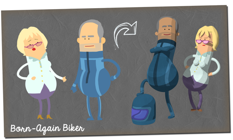
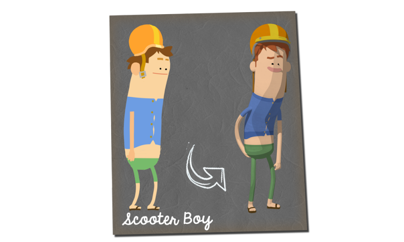
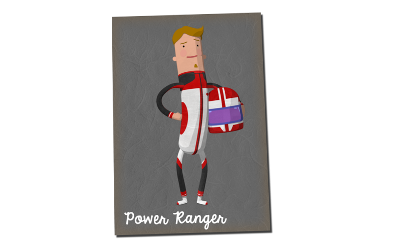
Character Concepts
After being supplied with reference images for the characters to be created, we combined a range of visual attributes to result in a light-hearted take on cliched rider personas

Our 2D/3D style
Animation was chosen as the medium for this campaign based on the success of other animated campaigns within the realm of road safety. Animation meant we could be more playful with the scenarios, we didn’t want the piece to be ultra realistic doom and gloom.
It was also more cost effective to work with animation rather than hiring live action second unit crews and creating expensive visual effects sequences.
Mixing 2D animation with 3D animation meant we could reduce costs at the lighting and rendering stage which allowed us to spend the majority of the limited budget on the animation itself.
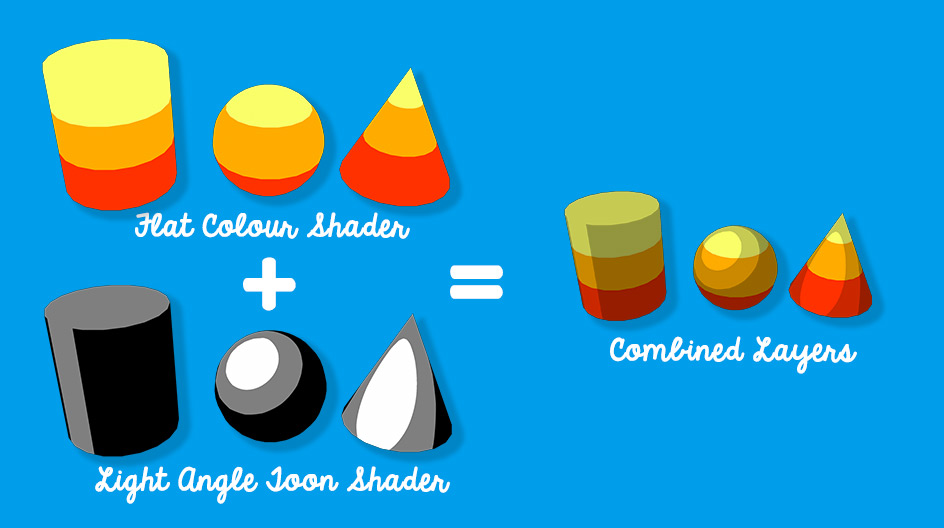
To achieve the look of the film we rendered a diffused colour pass which was then overlayed by a light angled toon shader pass and then composited.
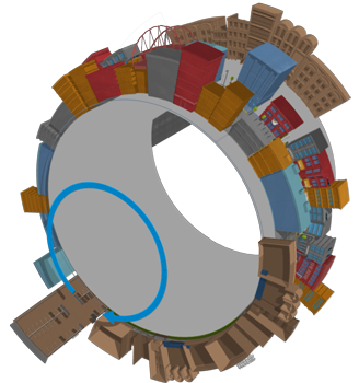
Our Cylinder Scene
For many of the shots used within the animation we used a technique to help manage two specific problems.
1. The aesthetic need for our choice of a curved horizon.
2. A method in which we could reduce the environment size.
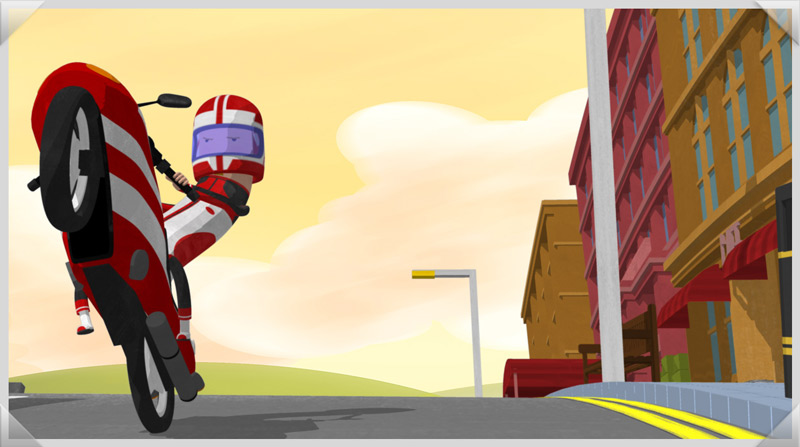
This technique allowed us to repeat sections of environment without it being too obvious to the audience.
Storyboard / Layout
Take a look at our storyboard / animatic to layout stage comparison. Here you’ll be able to see how close we try to stick our original plans.
Celebrity Cameos
If you look closely you’ll notice around 50 famous faces in the background. We added these extra characters firstly to populate the environment, but also to add a second tier interest provoking comments on social media. The idea was to give viewers a reasons to watch the film again with friends to try and spot all the characters, thus increasing engagement.

